MUNICIPAL WEBSITE
How might we make the website for the City of San Jose user friendly.
How might we make the website for the City of San Jose user friendly.
The website for the City of San Jose needs a more user friendly design. It is currently very information heavy. While transparency and open government are essential standards, there is a need to assess what is being offered and to ensure that content being offered is in line with content that users need regularly and to organize it in a way that will ensure they can find what they’re looking for easily.
Redesign the website by applying established UI standards based on data gathered through user research and continual user testing so that the result is a simpler, easier and user-friendly way for users to find necessary information efficiently.
UX UI Designer
4
3 weeks
Figma, Invision, Photoshop, Illustrator, Trello, Quicktime
We understand better San Jose city, learning from our 4 user residents, they find the website looks trustworthy, but there is too much text, they expected to be more innovative.
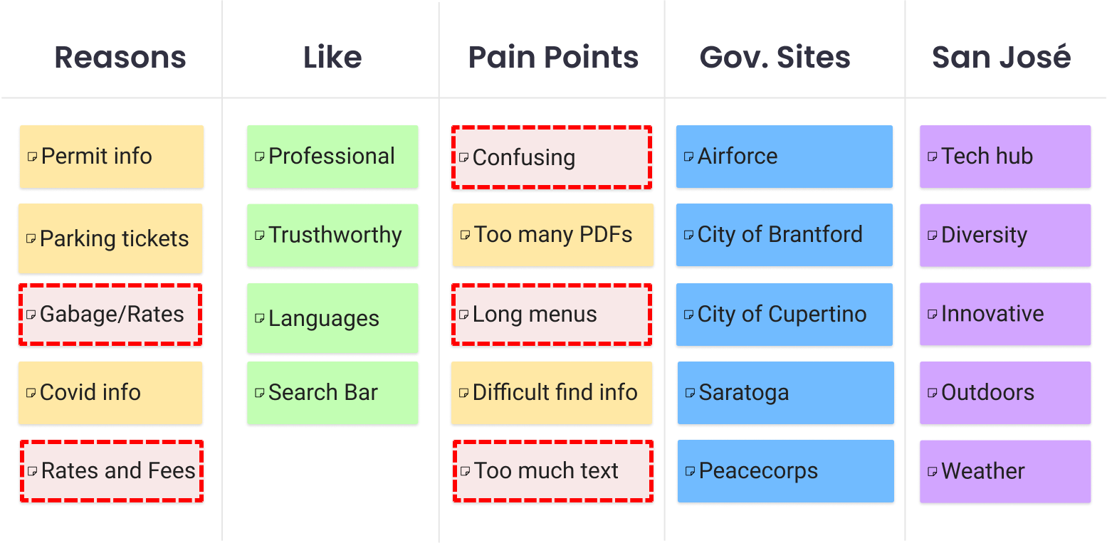
The website has too much text, the navigation bar is confusing and there is no easy way to find common tasks.

The website has too much text, the navigation bar is confusing and there is no easy way to find common tasks.